Showing posts with label #cssbasictips. Show all posts

How to create Social Icons with CSS?

How to create social media icons with the help of CSS coding.

There are several third party tools or websites which are offering social media icons with a simple click.

Do you think that why they are offering you free service?

I hope you don't bother about this. But, I have few reason behind these free offerings.

Why we should create our social icons?

As per my observation, these below are top reasons that we should not use third party social icons on our websites/blogs.

And we should try to create our own social icons.
  1. Slowdown Host website
  2. Automatically gives Backlink to their website
  3. Add dofollow link for their websites (A thought)

However, I too, use these free services on my blogs but most of the time I use self created social media icons on my website.

So in this post, I am going to discus an easy way to create social media icons.

And all you can do with the help of little knowledge of CSS coding.

Don't worry, if you don't know about CSS, I will explain to you. Learning CSS is very easy and interesting too.


Create Social Media Icons

<html>
<head>
<style type="text/css">
#youtube 
{
  background-image: url(youtube.jpg);
  background-position: 50% 50%;
  background-repeat: no-repeat;
background-origin: border-box;

  display: inline-block; 
  width: 100px; 
  height: 100px;
  border-width: 50px;
  border-color: rgba(0,0,0,0);

  border-radius: 100%;
  -moz-border-radius: 100%;
  -webkit-border-radius: 100%;
 
  -webkit-box-sizing: border-box;
  -moz-box-sizing: border-box;
  box-sizing: border-box;

  -webkit-transition: 2s ease;
  -moz-transition: 2s ease;
  -ms-transition: 2s ease;
  -o-transition: 2s ease;
  transition: 2s ease;
}

#youtube:hover 

{
  border-width: 0;
  border-color: rgba(0, 0, 0, 0.5);
}
#facebook 
{
  background-image: url(facebook.jpg);
  background-position: 50% 50%;
  background-repeat: no-repeat;
  background-origin: border-box;

  display: inline-block; 
  width: 100px; 
  height: 100px;
  border-width: 50px;
  border-color: rgba(0,0,0,0);

  border-radius: 100%;
  -moz-border-radius: 100%;
  -webkit-border-radius: 100%;

  -webkit-box-sizing: border-box;
  -moz-box-sizing: border-box;
  box-sizing: border-box;

  -webkit-transition: 2s ease;
  -moz-transition: 2s ease;
  -ms-transition: 2s ease;
  -o-transition: 2s ease;
  transition: 2s ease;
}

#facebook:hover 

{
  border-width: 0;
  border-color: rgba(0, 0, 0, 0.5);
}
#twitter 
{
background-image: url(twitter.jpg);
  background-position: 50% 50%;
  background-repeat: no-repeat;
  background-origin: border-box;

  display: inline-block; 
  width: 100px; 
  height: 100px;
  border-width: 50px;
  border-color: rgba(0,0,0,0);

  border-radius: 100%;
  -moz-border-radius: 100%;
  -webkit-border-radius: 100%;

  -webkit-box-sizing: border-box;
  -moz-box-sizing: border-box;
  box-sizing: border-box;

  -webkit-transition: 2s ease;
  -moz-transition: 2s ease;
  -ms-transition: 2s ease;
  -o-transition: 2s ease;
  transition: 2s ease;
}
#twitter:hover 
{
border-width: 0;
border-color: rgba(0, 0, 0, 0.5);
}
#pinterest 
{
  background-image: url(pinterest.jpg);
  background-position: 50% 50%;
  background-repeat: no-repeat;
  background-origin: border-box;

  display: inline-block; 
  width: 100px; 
  height: 100px;
  border-width: 50px;
  border-color: rgba(0,0,0,0);

  border-radius: 100%;
   -moz-border-radius: 100%;
  -webkit-border-radius: 100%;

  -webkit-box-sizing: border-box;
  -moz-box-sizing: border-box;
  box-sizing: border-box;
 
  -webkit-transition: 2s ease;
  -moz-transition: 2s ease;
  -ms-transition: 2s ease;
  -o-transition: 2s ease;
  transition: 2s ease;
}
#pinterest:hover 
{
  border-width: 0;
  border-color: rgba(0, 0, 0, 0.5);
}
.icon_one
{
  border-style: inset;
}
.icon_two
{
  border-style: outset;
}
.icon_three
{
  border-style: groove;
}
.icon_four
{
  border-style: ridge;
}
</style>
</head>
<body>
<div href="#" class="icon_one" id="youtube"></div>
<div href="#" class="icon_two" id="facebook"> </div>
<div href="#" class="icon_three" id="twitter"></div>
<div href="#" class="icon_four" id="pinterest"></div>
</body>
</html>


Copy and paste above CSS coding in our latest Online Editor for 2015 to check output live.


Points to Remember

Please change the source code of each image where you have saved or copied your images. Otherwise it will show a blank page of screen.

If you find any difficulty in creating these fancy social media icons, do let me know, I will help you out.

How to create Round Buttons with CSS?

How to create round buttons in CSS? This is very easy and CSSBasicTips has proven it to be easy in this post.


Create Round Buttons

There are thousands of examples for creating stunning menubar for your website or blog.

But as per my observation, still there is not any simple way of creating these menubar buttons.

If you stuck over there on any website or you really want to create horizontal or vertical menubar for your blog/website, then this post is meant for you.

Coding for creating Round Buttons with CSS

<html>
<head>
    <style type="text/css">
    .pretty_round-button 
    {
        width:80px;
        height:80px;
        line-height:80px;
        border: 5px solid #ffffff;
        border-radius: 50%;
        color:#ffffff;
        text-align:center;
        text-decoration:none;
        background: #ff2354;
        box-shadow: 0 0 5px black;
        font-size:20px;
        font-weight:bold;
display:inline-block;
    }
    .pretty_round-button:hover 
    {
        background-color: #efefef;
color:#ff2354;
    }
    </style>
</head>
<body>
    <a href="" class="pretty_round-button">
Home
    </a>
    <a href="" class="pretty_round-button">
About
    </a>
    <a href="" class="pretty_round-button">
Contact
    </a>
</body>
</html>

Output of above cod is as shown below:-


Home About Contact

Hover your mouse pointer and see the hover effect of the buttons. Creating horizontal menu buttons with css is as simple as 123.

How to create Vertical Menubar easily?

This is very simple and you have to just remove one word from the above coding of creating horizontal menubar.

Just remove "Inline" from the coding "Display" and you code will look like:-

display:block;

If you have any problem in creating horizontal or vertical menubar in CSS, do not hesitate, just comment in the below section and we will give instant help.

You can also check this coding for live output with the help of our Online Editor of 2015.

How to create CSS Shapes Easily with CSSBasicTips?

How to create CSS Shapes easily? If you want to create shapes with css (stylesheet) then you must know CSSBasicTips.


What is CSS Shapes?

If you want to create shapes like square, rectangle, circle or oval with the help of CSS then CSSBasicTips blog is the best place to learn and implement your CSS skills.

You can also create responsive shapes with the help of style sheet (CSS). Initially it was possible only with the images but now you can create every type of shape with the help of CSS coding.

How to create Square with CSS?

First of all I will share the best way to create a square with the help of CSS (stylesheet).
  1. Copy the stylesheet coding between the <head> </head> tags.
  2. Copy the Div tag coding in the body section.
  3. Save your file and then check in browser.


<style type="text/css">
.square
{
    width: 300px;
    height: 300px;
    background-color: #FF2354;
}

span
{
    text-align: center;
    color: white
}

</style>
<div class="square">
    <span>This is a square box with size 300 x 300 pixel with text as centered</span>
</div>

Output (300 x300) Pixel Square

How to create square shape with CSS coding

How to create Rectangle with CSS?

To create a rectangle with CSS coding, just follow the instructions give below:- 


<style type="text/css">
.rectangle
{
    width: 400px;
    height: 200px;
    background-color: #FF2354;
}

span
{
    text-align: center;
    color: white
}

</style>
<div class="rectangle">
    <span>This is a rectangle box with size 400px width and 200px height with text as centered</span>
</div>

Output (400 x200) Pixel Rectangle

How to create a rectangle with CSS coding

How to create Circle with CSS?

To create a circle with CSS coding, just follow the instructions give below. This is as simple as making a square or rectangle. 


<style type="text/css">
.circle
{
    width: 400px;
    height: 400px;
    background-color: #FF2354;

    border-radius:50%;
}

</style>
<div class="circle"></div>

Output (400 x400) Pixel Circle

How to create a circle with CSS Coding

How to create Triangles with CSS?

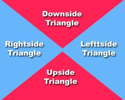
There are four main triangles in the box as shown in below image.

How to create four triangles of a box?
Now, I am going to create each side of the triangle with step by step coding. You just copy and paste the coding in the online editor of this blog to check the live output.

Creating Upside Triangle

<html>
<head>
<style type="text/css">
.triangle-up
{
    width: 25%;
    height: 0;
    padding-left:25%;
    padding-bottom: 25%;
    overflow: hidden;
}
.triangle-up:after
{
    content: "";
    display: block;
    width: 0;
    height: 0;
    margin-left:-500px;
    border-left: 500px solid transparent;
    border-right: 500px solid transparent;
    border-bottom: 500px solid #FF2354;
}
</style>
</head>
<body>
<div class="triangle-up">
  
</div>
</body>
</html>

Creating Downside Triangle

<html>
<head>

<style type="text/css">
.downside_triangle
{
    width: 25%;
    height: 0;
    padding-left:25%;
    padding-top: 25%;
    overflow: hidden;
}
.downside_triangle:after
{
    content: "";
    display: block;
    width: 0;
    height: 0;
    margin-left:-500px;
    margin-top:-500px;
   
    border-left: 500px solid transparent;
    border-right: 500px solid transparent;
    border-top: 500px solid #FF2354;
}
</style>


</head>
<body>
<div class="
downside_triangle"></div>
</body>
</html>

Creating Leftside Triangle

<html>
<head>
<style type="text/css">
.leftside_triangle
{
    width: 25%;
    height: 0;
    padding-top: 25%;
    padding-bottom: 25%;
    overflow: hidden;
}
.leftside_triangle:after
{
    content: "";
    display: block;
    width: 0;
    height: 0;
    margin-top:-500px;
   
    border-top: 500px solid transparent;
    border-bottom: 500px solid transparent;
    border-right: 500px solid #
65B5F9;
}
</style>
</head>
<body>
<div class="leftside_triangle"></div>
</body>
</html>

Creating Rightside Triangle

<html>
<head>
<style type="text/css">
.rightside_triangle {
    width: 0;
    height: 0;
    padding-top: 25%;
    padding-bottom: 25%;
    padding-left: 25%;
    overflow: hidden;
}
.rightside_triangle:after {
    content: "";
    display: block;
    width: 0;
    height: 0;
    margin-top:-500px;
    margin-left: -500px;
   
    border-top: 500px solid transparent;
    border-bottom: 500px solid transparent;
    border-left: 500px solid #65B5F9;
}
</style>
</head>
<body>
<div class="rightside_triangle"></div>
</body>
</html>

You can check all the coding in the online editor of this blog. This is the latest Online Editor of 2015.

Chapter 16 - What is Border in CSS?

Border is an outline of any element created in HTML with the help of style sheet or css. You can set the color, style or thickness if required. All can be done in the css style sheet.

It has 3 attributes and you can either use one in each declaration or your can use all in one line of css code.

Border

Example for Border declaration:-
 /*Syntax of Border declaration in CSS*/

 bborder:10px solid #ff2354;
 

What are 3 attributes of Border?
  1. Color
  2. Style
  3. Width

Border Color

If you want to set the color of the border, you can use border-color property. It has 4 values to use. You can use which you are comfortable with.
  1. Color Name
  2. Hexadecimal Number
  3. RGB Color code
  4. Transparent

Example for Border Color:-

 /*Syntax of Border Color in CSS*/

 bborder-color:#ff2354;
 

Border Style

There are border styles in css and you can set the border style as per your requirement. It has 9 values to choose.
  1. None 
  2. Solid
  3. Dashed
  4. Dotted
  5. Double
  6. Inset
  7. Outset
  8. Groove
  9. Ridge
  10. hidden

Example for Border Style:-

 /*Syntax of Border Style in CSS*/

 bborder-style:5px solid;
 

Border Width

Border width is an important attribute in css if you are using this property with any of your element in the HTML page. You can set each side a different value.

It has 4 values:-
  1. Length (Pixel)
  2. Thin
  3. Thick
  4. Medium

Example for Border Width:-

 /*Syntax of Border Width in CSS*/

 bborder-width:value;
 

As you know that there are 4 sides of border and you can set each side with different color, style and width.
4 sides of Border
  1. Border-Top
  2. Border-Bottom
  3. Border-Left
  4. Border-Right
You can also set each side with different style, color and width:

Example for Border Style with different sides:-

 /*Syntax of Border Style with different sides in CSS*/

 /*TOP Border*/
 border-top-color:#ff2354;:
 border-top-width:2px;
 border-top-style:dashed;

 /*Bottom Border*/
 border-bottom-color:#ff2354;:
 border-bottom-width:4px;
 border-bottom-style:dotted;

 /*Left Border*/
 border-left-color:#ff2354;:
 border-left-width:6px;
 border-left-style:solid;

 /*Right Border*/
 border-right-color:#ff2354;:
 border-right-width:7px;
 border-right-style:groove;
 

NOTE:- To use properties of border and its relevant values, read posts on each topic in the next section of this blog.

Chapter 15 - What is Background in CSS?

Like other elements, you can format background of any element with the help of style sheet. CSS has enhanced features than HTML to set background of an element.

You can set background of an element in 3 different ways of your choice or page requirement.

An element can have following three attributes:-
  1. Background Color
  2. Background Image 
  3. Background Color + Image (both)
When you use 2nd and 3rd attribute, further these have 3 common attributes to set background position, attachment, and background repeat:-
  1. Background Attachment
  2. Background Position
  3. Background Repeat

How to set Background property with css coding?

Now let us discuss all the attributes of Background with an example of each:-

Background-Color

If you want to set color for your HTML page or any other element created on the page, you can use this attribute to set the color.

Example for setting Background Color:-

 /*Syntax of Background Color in CSS*/

 height:200px;
 width:200px;
 background-color:red;
 

Above example will create a square box of 200px height and 200px width with Background color as RED.

Background color has 4 values:-
  1. Color Name  (red, green blue etc)
  2. Hexadecimal Number  (#ff33ea, #123456,...etc)
  3. RGB color code - rgb(123,0,255)
  4. Transparent

Background-Image

If you want to set an image for your HTML page or any other element created on the page, you can use this attribute to set the image. 

The css code is quite similar to the background color attribute but the attribute and values are different.


Example for setting Background Image:-

 /*Syntax of Background Image in CSS*/

 height:200px;
 width:200px;
 background-image:url('myimage.jpg');
 

Above example will create a square box of 200px height and 200px width with Background image.

Background Image has 2 values:-
  1. url - (Path where your image is stored)
  2. none

Background Color + Image

Sometime it happens that your image load time increased and it shows an empty image area. This is not good for a website or blog.

To handle this situation, we suggest you to use this property of background image with color.

Example, setting Background Image with color:-

 /*Syntax of Background Image with color in CSS*/

 height:200px;
 width:200px;
 background:#ff2354 url('myimage.jpg');
 

Above example will create a square box of 200px height and 200px width with Background image.

But if your image is not loading then it will show you the color you set with the url of your image.

Background Attachment

You can control the attachment of background image in style sheet. This is quite easy and a good practice to handle an image.

This property has 2 values to use with the image. If you want to scroll the image with the page or if you want to fix the image to some point on the page.
  1. Fixed - It will fix the image and will not allow image to scroll with the page.
  2. Scroll - It will scroll the image with page scroll

Example for setting Background Attachment:-

 /*Syntax of Background Attachment in CSS*/

 background-attachment:value;
 

Background Position

You can control the background position of your HTML element with the help of CSS (stylesheet). If you want to position an element, then you can do this by using background-position property of style sheet.

It has following 11 values to use for setting up the background position of an element.
  1. top left 
  2. top center
  3. top right
  4. center left
  5. center center
  6. center right
  7. bottom left
  8. bottom center
  9. bottom right
  10. x-% y-% 
  11. x-pos y-pos

Example for setting Background Position:-

 /*Syntax of Background Position in CSS*/

 background-position:value;
  

Background Repeat 

You can set an to repeat itself or not within your HTML page. It has 4 values to set.
  1. Repeat
  2. No Repeat 
  3. Repeat X
  4. Repeat Y

Example for setting Background Repeat:-

 /*Syntax of Background Repeat in CSS*/

 background-repeat:value;


NOTE:- To use properties of background and its relevant values, read posts on each topic in the next section of this blog.